If you’ve been scrolling past room reveals and wondering why the same muddy greens and creamy whites keep appearing, there’s a reason. The color conversation in residential design has shifted decisively for 2026, and Virginia homeowners are right at the center of it.
Prince William County sits in a particularly interesting position: close enough to Washington, D.C., to feel the pull of contemporary, globally influenced design, yet rooted in a landscape of soft Blue Ridge light, brick-and-stone architecture, and four distinct seasons. That context shapes everything — from the undertones that read well in your living room to the textures that make a bedroom feel genuinely restful.
This guide covers the dominant palettes, the texture strategies, and the room-by-room moves that will define interior design services in Virginia in 2026. Whether you’re planning a full renovation or simply refreshing a few key rooms, read on before you reach for a paint deck.
The Dominant Colour Palette of 2026 in Virginia Homes
The clearest shift in 2026 is a move away from the cool grey-white spectrum that dominated the last decade and toward warmer, more mineral-influenced hues. Think of the palette of a mid-century Virginia quarry: ochres tempered by stone grey, dusty sage sitting alongside raw linen, and terracotta anchored by deep navy.
Warm Mineral Neutrals
Shades in the warm beige–clay–greige range are replacing the cooler greys that once felt universally ‘safe.’ These tones read differently depending on your light exposure. In a south-facing room in Woodbridge or Manassas, a clay-white like Benjamin Moore’s White Dove OC-17 looks luminous and alive. In a north-facing study, the same color can read flat—here, a slightly deeper greige (think Sherwin-Williams’ Accessible Beige SW 7036) provides warmth without muddiness.
Botanical Greens
The green trend has matured. Early-cycle sage was soft and muted; 2026 brings more complexity. Look for greens with visible grey or blue undertones, ‘juniper’ greens, forest tones with depth, and the occasional olive with an almost-khaki quality. These colors align beautifully with the wooded lots and greenery common across Gainesville, Nokesville, and the Lake Ridge area.
Deep Anchor Colours
Every sophisticated interior needs at least one moment of depth. Midnight navy, iron black, and dark ink blue are being used boldly in 2026, not just on accent walls but on cabinetry, front doors, and library shelving. Paired correctly with warm neutrals and natural materials, these anchor colors give a home its sense of intention.
The Quiet Luxury Accent
Soft terracotta and muted coral are having a refined moment, not the bright Southwest palette of the 1990s but something more muted, almost faded. Used as an accent in cushions, ceramic vessels, or a single painted alcove, this tone adds life to any of the neutral palettes above.
For a quick reference on what works best in Virginia homes, warm mineral neutrals and botanical greens are the workhorses of 2026, with deep navies and ink tones as bold anchors and muted terracotta as the accent that ties the story together.
Texture Layering: Why It Matters More Than Colour Alone
Here is a truth that often surprises homeowners: two rooms painted the same color can feel completely different if the textures are handled differently. In 2026, the designers producing the most interesting results are those treating texture as a primary design tool, not an afterthought.
What Is Texture Layering?
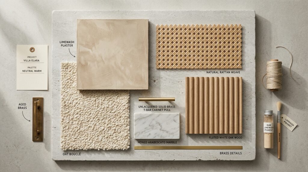
Texture layering is the deliberate combination of tactile and visual surface qualities across a single space: rough beside smooth, matte beside sheen, and natural beside refined. The goal is a room that rewards close attention and feels ‘full’ without being cluttered.
Materials Leading the Conversation in 2026
• Limewash and Venetian plaster walls: These finishes are replacing flat paint in feature spaces across the region. They have subtle depth that changes with natural light throughout the day, something no standard roller finish can replicate.
• Bouclé and bouclé-adjacent upholstery: The looped texture of bouclé fabric continues to lead, particularly in sofas and armchairs. It reads luxurious but is surprisingly durable.
• Rattan and cane: Woven natural fibers are back as a genuine design choice, not a nostalgic callback. In lighting, side tables, and cabinet inserts, cane brings warmth and breathability.
• Fluted and reeded timber: Vertical grooves on cabinetry, media units, and even door surrounds add architectural interest without extra space.
• Honed stone and terrazzo: In kitchens and bathrooms across Prince William County, polished marble is giving way to honed finishes and terrazzo tile—materials that hide wear better and look more contemporary.
The Rule of Three Textures
A practical framework: Aim for three distinct texture categories in any given room—one rough or organic (linen, rattan, or limewash), one mid-weight (wool, timber, or honed stone), and one refined or smooth (glass, metal, or lacquer). Rooms that stay within one category feel either harsh or bland; three creates balance.
For homeowners in Prince William County, where lot sizes often allow for dedicated living rooms and study spaces, texture layering is the single most effective way to elevate rooms that are already well-proportioned.
Room-by-Room Colour Recommendations for Prince William County Homes
Living Rooms
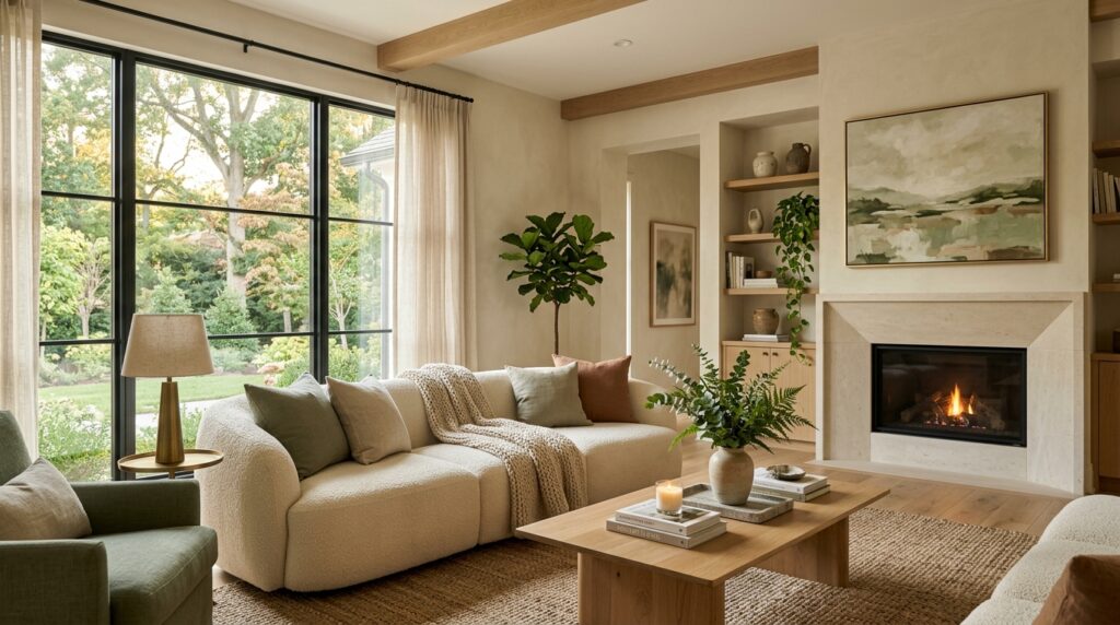
2026 living rooms are warm, not stark. A greige or warm white base paired with one deep botanical green accent—perhaps on a single paneled wall or in the upholstery—creates a sophisticated anchor. If your living room faces west (common in many newer Gainesville builds), lean into warm ochre-adjacent tones in late afternoon; they will look extraordinary in the golden-hour light Virginia delivers from April through October.
Kitchens
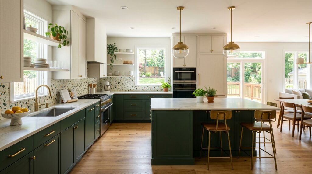
Kitchen colors are dividing into two clear camps in 2026. The first is the all-white kitchen done properly — warm white (not cool) cabinetry, honed stone countertops, and brass or aged bronze hardware that stops it feeling sterile. The second is the two-tone kitchen: upper cabinets in a soft warm white or linen and lower cabinets in deep navy or forest green. Either approach works well in the open-plan layouts typical of Prince William County’s newer construction.
Primary Bedrooms
Bedrooms are where restraint pays dividends. The most restful primary bedrooms in 2026 stay within a very narrow tonal range: think three shades of the same color family rather than contrasting colors. Dusty blue-green walls with oat-linen bedding and a deeper teal throw read as cohesive and calm. Avoid bright whites in bedrooms; they amplify early-morning light in ways that interrupt sleep quality.
Home Offices
Prince William County’s significant remote-working population means home offices are being taken seriously as design spaces. In 2026, the recommended approach is a mid-depth color on walls—dark sage, warm terracotta, or even a deep plum for north-facing rooms—combined with excellent task lighting and timber or leather desk accessories. The psychology is straightforward: a slightly enclosed color environment improves focus compared to an all-white room.
Bathrooms
Bathroom color trends in 2026 are moving toward earthy, spa-adjacent tones: warm stone, aged linen, and terracotta tile with grout lines in a contrasting deep gray. Feature walls in limewash or Venetian plaster are particularly effective here, where the humidity actually helps the finish develop its characteristic depth over time.
How a Professional Colour Consultation Saves You Money
There is a pervasive assumption that a color consultation is a luxury reserved for large renovation projects. In practice, the opposite is often true: it is the homeowners undertaking smaller refreshes—repainting two or three rooms, updating a kitchen, or refreshing a bathroom—who gain the most from professional guidance.
The Real Cost of Getting It Wrong
Paint, primer, and labor for a standard room run anywhere from $400 to $900 in the Northern Virginia market. A color that looks wrong once on the wall—too cool, too dark, or simply at odds with your flooring—means paying for it again. A single color consultation typically costs a fraction of one repaint job.
What a Consultation Actually Covers
A professional color consultation goes beyond pointing at paint chips. An experienced residential interior design services provider will assess your existing fixed elements (flooring, cabinetry, and architectural trim); your light conditions across different times of day; your furniture and soft furnishings; and your personal preferences before making any recommendations.
They will also consider the color relationships between adjacent rooms—critical in open-plan homes where three or four spaces are visible from a single point.
The Value of a Second Eye
Beyond the technical considerations, there is genuine value in an objective professional perspective. Most homeowners are too close to their own space — they stop seeing what is actually there. A designer walking in fresh will notice immediately that the warm brown of your hardwood floors is fighting the cool gray on your walls, or that a mid-tone color in your hallway would make your living room feel larger by contrast.
For Prince William County homeowners specifically, the regional design context matters. Color choices that photograph beautifully in a Scandinavian apartment may simply not work in a 2,500-square-foot Colonial with eight-foot ceilings and a brick exterior. A local interior design services specialist in Virginia brings that regional lens to every recommendation. Not sure which colors are right for your home? Book a color consultation with Statement Design Concepts and get expert guidance tailored to your home, your light, and your lifestyle.