Have you ever finished decorating a room, stepped back, and thought, “Something still feels off”?
The furniture looks good. The paint is beautiful. The décor is stylish. Yet the space feels slightly chaotic or incomplete.
In most cases, the issue isn’t what you chose—it’s how the colors are distributed.
That’s where the 60/30/10 rule in interior design becomes a game-changer. This timeless color balance formula gives structure to your palette, ensuring harmony and visual flow in any room. Designers rely on it constantly because it prevents imbalance before it happens.
Let’s break it down clearly and professionally so you can apply it with confidence.
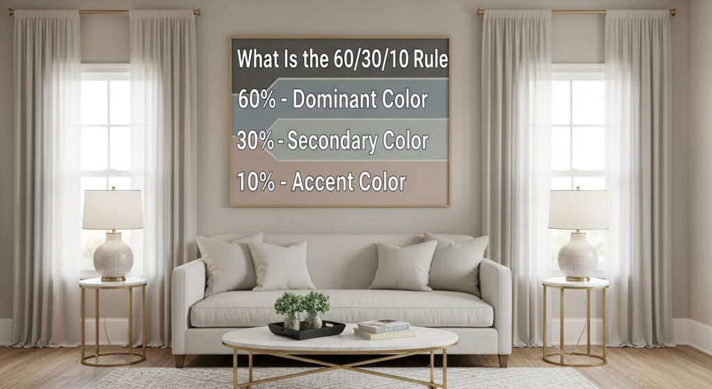
What Is the 60/30/10 Rule?
The 60/30/10 rule is a decorating formula used to create a balanced distribution of interior colors within a space. It divides your room’s color palette into three proportions:
- 60% – Dominant Color
- 30% – Secondary Color
- 10% – Accent Color
This ratio establishes hierarchy. Instead of allowing colors to compete, you assign them roles. When applied properly, the result is cohesive, polished, and professionally styled.
Why This Rule Works Psychologically
Humans naturally seek order. When color is evenly scattered without structure, the eye struggles to settle. That creates subtle discomfort.
The 60/30/10 rule solves this by:
- Creating a clear focal hierarchy
- Preventing visual overload
- Encouraging smooth transitions between elements
- Supporting balance in the overall design
It works in modern, traditional, luxury, and minimalist interiors because it’s rooted in proportion—not trend.
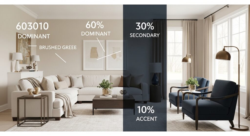
Breaking Down the Percentages in Detail
60% – The Dominant Color
This is your base—the visual anchor of the room.
It usually appears in:
- Walls
- Large rugs
- Main sofa or bed
- Built-in cabinetry
Your dominant color should be versatile and livable. Neutrals are popular because they adapt easily, but bold shades can work beautifully if applied consistently.
For example:
- 60% warm greige walls and sectional
- 60% soft white walls and cabinetry
- 60% muted sage across walls and large furnishings
The dominant color sets the mood of the room.
30% – The Secondary Color
This layer introduces contrast and depth.
It is commonly used for:
- Curtains
- Accent chairs
- Bedding
- Feature walls
- Dining chairs
The 30% color should support the base while adding dimension.
If your 60% is neutral, your 30% can be richer. If your base is bold, the secondary tone should soften the impact.
Example:
- 60% cream
- 30% navy
- 10% brass
This layering creates balance without chaos.
10% – The Accent Color
This is the most expressive layer.
Accent colors appear in:
- Throw pillows
- Artwork
- Decorative objects
- Lamps
- Floral arrangements
The purpose of the 10% is to energize the space.
However, restraint is critical. When accent colors exceed their proportion, the room loses clarity. Many decorating mistakes happen here—too many bright accessories disrupt harmony.
Keep it intentional.
Step-by-Step Guide to Applying the 60/30/10 Rule
Step 1: Start with Fixed Elements
Look at flooring, countertops, or large furniture pieces that won’t be easily changed. Build around them.
Step 2: Choose Your Dominant Color
Select a tone that complements fixed elements and defines the atmosphere.
Step 3: Add a Supporting Shade
Introduce a secondary color that contrasts gently.
Step 4: Select a Strategic Accent
Choose one bold tone and repeat it consistently in small doses.
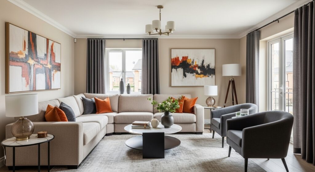
Real Room Applications
Living Room Example
- 60% beige walls and sectional
- 30% charcoal accent chairs and curtains
- 10% burnt orange cushions and art
Result: Warm, grounded, visually dynamic.
Bedroom Example
- 60% soft white
- 30% dusty blue
- 10% matte black accents
Result: Calm and contemporary.
Kitchen Example
- 60% white cabinetry
- 30% natural wood island
- 10% black hardware
Result: Clean and cohesive.
Common Mistakes to Avoid
Even when using this decorating formula, errors can happen.
1. Ignoring Visual Weight
A dark navy sofa carries more visual weight than a pale one. Adjust percentages accordingly.
2. Adding Too Many Accent Colors
Stick to one primary accent. Mixing red, teal, and mustard simultaneously creates an imbalance.
3. Forgetting Texture
Color alone doesn’t create dimension. Add contrast through materials:
- Linen
- Wood
- Metal
- Glass
Texture enhances color depth.
4. Poor Lighting Choices
Lighting temperature affects perception. Warm lighting softens colors; cool lighting sharpens them. Always test before committing.
Does It Work in Small Spaces?
Absolutely—and often even better.
In small rooms:
- Keep the 60% light to enhance openness.
- Use the 30% for subtle depth.
- Keep accents minimal and strategic.
Structured interior color distribution prevents compact rooms from feeling crowded.
Comparing 60/30/10 vs 70/20/10
You may encounter the 70/20/10 version.
The difference lies in emphasis:
- 70% creates stronger cohesion.
- 20% introduces a lighter contrast.
- 10% remains the accent.
Choose 60/30/10 for layered interiors.
Choose 70/20/10 for minimalist spaces.
Advanced Designer Insight: Surface Area vs Visual Impact
Professionals don’t calculate percentages with a measuring tape. They consider:
- Surface exposure
- Light reflection
- Color saturation
- Placement
For example, a single dark feature wall may visually feel like 40% even if it covers less physical area.
Understanding visual weight refines your application of the rule.
When to Break the Rule
The 60/30/10 rule in interior design is foundational but not absolute.
You may bend it when:
- Designing eclectic interiors
- Creating monochromatic schemes
- Styling maximalist environments
However, mastering the rule first allows you to break it intelligently.
Why This Rule Ranks Among the Most Important Interior Design Principles
Among all decorating guidelines, this color balance formula remains essential because:
- It’s beginner-friendly
- It prevents expensive mistakes
- It works across styles
- It enhances visual harmony
- It simplifies decision-making
When homeowners struggle with indecision, applying structure immediately clarifies choices.
Final Thoughts
The difference between a room that feels “nice” and one that feels professionally designed often comes down to proportion.
The 60/30/10 rule in interior design gives your space hierarchy, rhythm, and clarity. It ensures that no element competes unnecessarily and that every color has a purpose. If your home feels slightly chaotic, reassess your interior color distribution. Reduce competing tones. Strengthen your dominant shade. Refine your accents.
Design is not about copying trends; it’s about intentional balance. Master this decorating formula once, and you’ll never approach color randomly again.
Ready to balance your home’s palette? Explore our expert business design services for workspaces or reach out for a residential consultation today!