If you’ve ever decorated a room and still felt like something wasn’t right, you’re not alone. Many homeowners assume they need better furniture or more décor. In reality, what’s missing is usually structure.
Professional designers rely on proven interior design rules to create spaces that feel balanced, cohesive, and intentional. These rules are not restrictive. They are frameworks that prevent common mistakes and make decorating easier.
Let’s break them down in depth—in a way that’s practical and easy to apply.
Why Interior Design Rules Matter
A well-designed room does three things:
- Feels visually balanced
- Functions efficiently
- Creates emotional comfort
When a space feels chaotic, cramped, or unfinished, it usually violates one of the foundational rules: color balance, proportion, scale, or visual hierarchy. Understanding these principles saves you money, prevents costly design errors, and helps you decorate confidently.
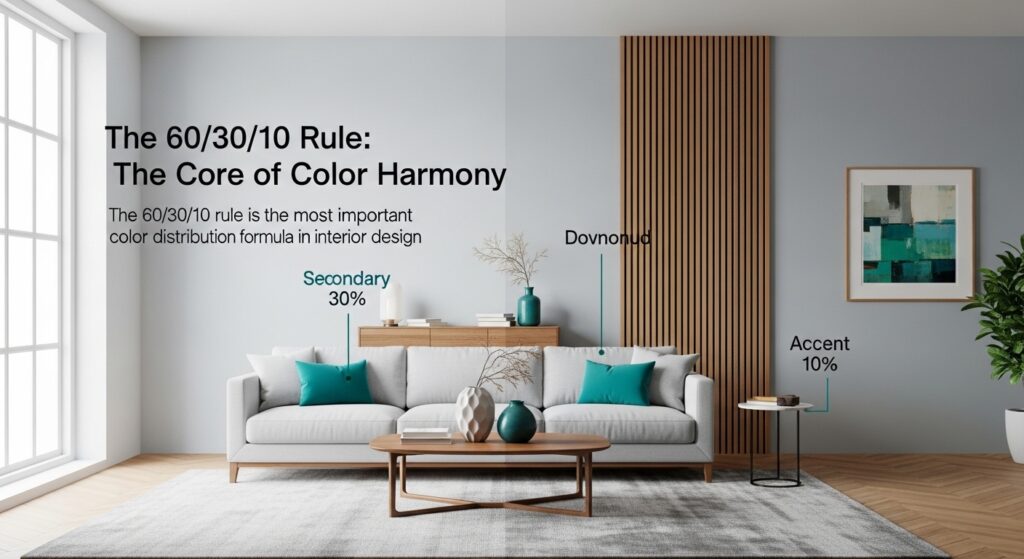
1. The 60/30/10 Rule: The Core of Color Harmony
The 60/30/10 rule is the most important color distribution formula in interior design.
It divides your room’s color palette into three parts:
- 60% – Dominant color (walls, large rugs, main sofa)
- 30% – Secondary color (curtains, chairs, bedding)
- 10% – Accent color (cushions, artwork, lamps, décor)
Why This Rule Works
Humans respond positively to hierarchy. When one color dominates, the room feels organized. When colors are evenly distributed, everything competes for attention. The 60/30/10 rule prevents visual tension and ensures harmony.
Practical Example
Living room:
- 60% warm beige (walls + large sectional)
- 30% deep olive (armchair + curtains)
- 10% brass and black accents (lamps + frames)
The result? Cohesive, layered, intentional.
Common Mistake
People often make their accent color too dominant. If your 10% becomes 25%, the balance collapses. Keep accents controlled.
2. The 70/20/10 Rule: A Modern Variation
The 70/20/10 rule is slightly more restrained.
- 70% base
- 20% support
- 10% accent
This works beautifully in modern, Scandinavian, or minimalist interiors where cohesion is key.This variation is often used in our all-inclusive residential design packages to strengthen unity in open floor plans.
When to Use It
- Open floor plans
- Neutral-heavy palettes
- Luxury contemporary homes
This variation strengthens unity and reduces visual clutter.
3. The 3-Color Rule: Simplicity Creates Sophistication
One of the simplest yet most powerful interior design rules is the 3-color rule.
Limit your room to three primary colors. Why? Because too many colors fragment a space. Three creates visual rhythm without chaos.
Designer Approach
Instead of adding new colors, vary tones and textures within your chosen palette.
Example:
- Cream
- Taupe
- Charcoal
Then add interest through:
- Linen
- Wood
- Metal
- Velvet. The palette remains controlled, but the room feels dynamic.
4. Balance in Interior Design: Controlling Visual Weight
Balance in interior design refers to the distribution of visual weight.
Every object has visual weight depending on:
- Size
- Color
- Texture
- Placement
A dark leather sofa has more visual weight than a light linen chair. A large cabinet carries more weight than a small side table. If one side of the room feels heavier, the space becomes uncomfortable.
Types of Balance
Symmetrical Balance
Equal elements on both sides. Calm, formal, traditional.
Asymmetrical Balance
Different objects are balanced visually. Modern, relaxed.
Radial Balance:
Objects arranged around a central element. Great for dining spaces.
If your room feels “tilted,” rebalance the weight.
5. Proportion in Design: The Most Ignored Rule
Proportion in design is about size relationships.
Many rooms feel awkward, not because of style, but because of poor scale decisions.
Common Proportion Mistakes
- The rug is too small for the seating area
- Oversized sectional in a compact room
- A tiny art piece floating on a large wall
- Low-ceiling room with very tall cabinets
Correct Proportion Guidelines
- The rug should anchor furniture, not float separately
- The coffee table should be ⅔ the length of the sofa
- Artwork should cover 60–75% of the wall width above furniture
- Curtains should hang close to the ceiling to elongate the walls
When proportions align, the room feels polished instantly.
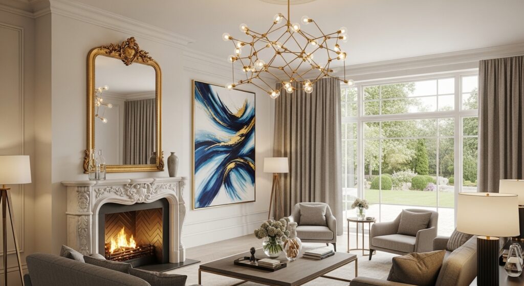
6. The Focal Point Rule: One Star Per Room
Every successful room has a focal point.
It could be:
- A fireplace
- A statement light fixture
- A dramatic piece of art
- A large window
Everything else should support that focal point. If you have multiple competing features—bold wallpaper, a colorful sofa, dramatic lighting, and oversized art—the eye becomes confused.
Choose one hero. Let everything else complement it.
7. Layering: Creating Depth and Dimension
Flat rooms lack personality. Depth comes from layering.
Professional designers layer through:
Texture
Mix smooth and rough surfaces:
- Linen + leather
- Wood + metal
- Velvet + glass
Lighting
Use three types:
- Ambient (ceiling lights)
- Task (reading lamps)
- Accent (wall lights, under-cabinet)
Height Variation
Incorporate tall, medium, and low elements:
- Tall plant
- Mid-height console
- Low coffee table
Layering makes the room feel curated rather than staged.
8. Negative Space: The Power of Restraint
One of the most overlooked interior design rules is knowing when to stop.
Space enhances impact.
If every surface is decorated:
- The eye has nowhere to rest
- The room feels smaller
- The design looks cluttered
Professional interiors intentionally leave breathing room. Restraint signals confidence.
9. Flow and Continuity: Connecting Spaces
In open layouts, rooms should feel connected.
Maintain continuity through:
- Repeated materials
- Consistent metal finishes
- Similar undertones in color
For example, if you use matte black hardware in the kitchen, repeat it in lighting or furniture frames in the living area. Consistency builds sophistication.
Bringing It All Together
When a room feels wrong, ask yourself:
- Is my color distribution balanced?
- Did I follow the 60/30/10 rule?
- Are there too many colors?
- Is the proportion in the design correct?
- Does the room have one focal point?
- Is balance in interior design maintained?
Design is not about buying expensive furniture. It’s about applying structure. The difference between amateur decorating and professional design lies in discipline—not budget. Master these interior design rules, and you’ll stop guessing. You’ll start designing with clarity, intention, and confidence.