
Key Takeaways
- The 5-10-15 rule layers a room as 70% neutral base, 15% secondary texture, 10% pattern, and 5% bold accent, a cozier alternative to the classic 60-30-10 color rule.
- Odd-numbered groupings (3, 5, or 7 objects) read as more natural to the eye than even pairs, making shelves and tables feel styled instead of random.
I used to think a beautifully decorated room came down to good taste. Then I started paying closer attention to how professional designers actually put a space together, and I realized taste is only half the story. The other half is proportion. A Houzz survey of more than 1,700 homeowners found that only 2% felt they had fully achieved their vision for their home, and most people said they were still only about halfway there. That gap usually isn’t about bad choices. It’s about balance. That’s where the 5-10-15 rule comes in, and once I started using it, I stopped second-guessing every color and object I brought into a room.
Here’s how I use it. About 70% of any space stays neutral, and the remaining 30% is split into three smaller layers:
- 15% for a secondary tone or texture that adds depth, like a rug, curtains, or a wood finish
- 10% for a pattern or material that brings in personality without overwhelming the room
- 5% for one bold, almost daring accent, a cushion, a vase, or a single piece of art
Splitting the room this way gives the eye more than one place to land, and that’s really what makes a home feel warm and lived-in instead of staged.
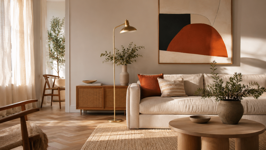
What This Layering Looks Like in a Real Room
In my own living room, the 70% base is a soft oatmeal paint and a light oak floor. The 15% layer is a woven jute rug and linen curtains, both in a warmer, slightly darker tone than the walls. The 10% shows up as a striped throw and a patterned lampshade. Then the 5% is a single deep terracotta cushion on the sofa. Nothing about it feels calculated when you walk in, but every piece is doing a specific job. That’s the whole point of a percentage-based rule: it takes the guesswork out of “does this look balanced” and gives you an actual system to check against, and it’s a big part of why a survey commissioned by Slickdeals found that 85% of homeowners still feel their home needs some kind of updating even after they’ve decorated it.
Grouping in Odd Numbers Ties It All Together
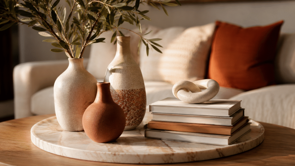
Once the layers are in place, how you arrange the objects within them matters just as much. This is where I lean on odd-numbered groupings, sometimes called the 3-5-7 rule in decorating. Our eyes don’t settle easily on odd numbers the way they do on pairs, so a shelf styled with three items, or a coffee table with five, creates a bit of visual movement instead of a flat, symmetrical stare-down. I usually break it down like this:
- Three larger pieces to anchor a surface or a furniture layout
- Five medium pieces to build the arrangement out
- Seven small details for mantels, bookshelves, or gallery walls
It sounds like a small detail, but it’s the difference between a table that looks curated and one that looks like it was just left there.
The Bigger Color Formula This Rule Borrows From
The 5-10-15 approach is really a more layered cousin of the classic color rules designers have used for decades. The most familiar version is 60% dominant color, 30% secondary, and 10% accent, though plenty of designers now prefer a slightly bolder split known as the 70-20-10 rule, where the dominant color takes up even more of the room and the remaining 30% is divided between a secondary shade and a punchier accent.
If you want the full breakdown of how these ratios compare room by room, this complete guide to interior design color rules walks through both in more detail. Both versions work on the same logic: pick one color to lead, one to support it, and one to add energy in small doses. The 5-10-15 method just breaks that middle “supporting” chunk into finer layers, which tends to read as cozier and more collected rather than corporate or overly rule-bound.
Splitting the Secondary Slice Into Two Smaller Shares
This is actually where the extra 15% in my rule comes from. Some designers, instead of committing a full 30% to one secondary color, split it into two 15% portions, one warmer and one cooler, or one in color and one in texture. It keeps the room from feeling like it’s built around exactly three swatches, which can start to feel formulaic in a large or open-plan space.
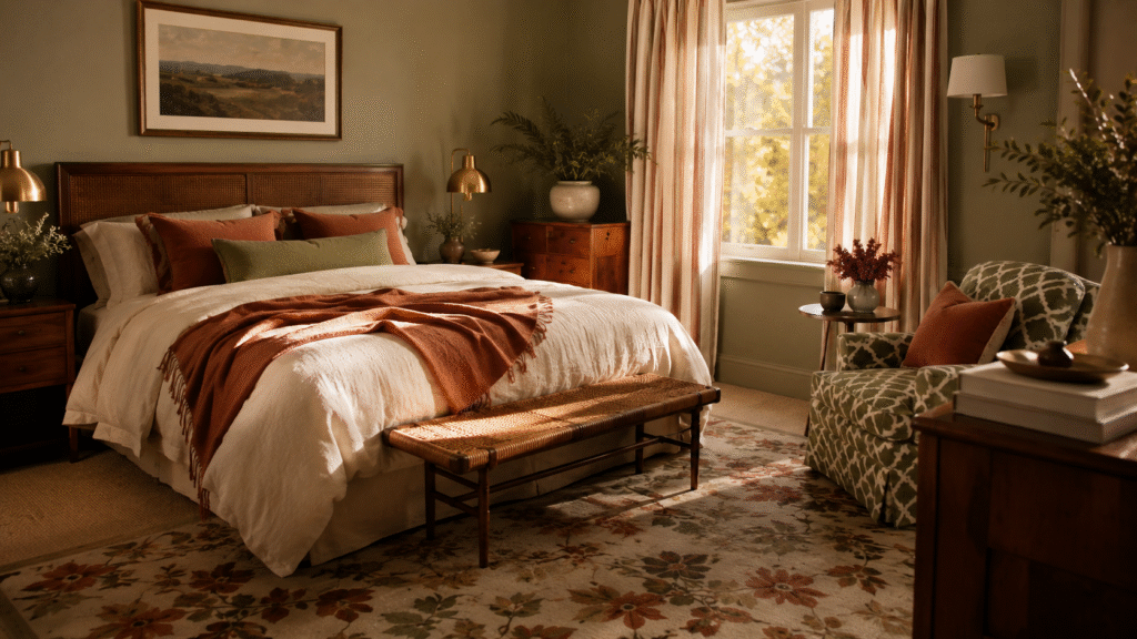
I do this often in bedrooms, where I’ll use one 15% for bedding and another for a chair or bench at the foot of the bed. If you’re still getting comfortable with the base version of this formula before splitting it further, it’s worth reading how to apply the 60/30/10 rule step by step first. It’s a small tweak, but it adds just enough variation to keep a neutral room from feeling one-note.
Five Foundations Every Design Rule Is Built On
No percentage rule works in isolation, and this is something I remind myself of constantly. Underneath all of these formulas sit five core principles of interior design:
- Balance – distributing visual weight so no corner of the room feels heavier than another
- Rhythm – repeating a color, shape, or texture so the eye keeps moving through the space
- Emphasis – choosing one focal point, like a fireplace or a piece of art, that everything else supports rather than competes with
- Proportion and scale – sizing furniture appropriately for the room and for each other
- Harmony – tying every piece together so the room reads as one idea instead of a pile of nice individual objects
Any percentage rule, including this one, is just a practical shortcut for applying these five ideas without having to think about them consciously every time.
Layering in Personality Through Pattern and Era
Once the structure is sound, I like adding a looser, more personal layer on top, which is close to what’s known as the 3-4-5 method in decorating. That approach suggests working with three patterns, four style eras, and five colours or textures across a room, mixing things like a striped chair, a floral rug, and a geometric pillow, or blending mid-century, traditional, and coastal influences instead of sticking to one strict style. I don’t follow it as rigidly as the colour percentages, but it’s a useful reminder that a cozy room usually isn’t a matchy one. It’s collected, a little imperfect, and built from pieces that were chosen over time rather than bought as a set.
Bringing It All Together
None of these rules are laws, and I break them constantly once a room starts to feel right. But when I’m staring at a space and don’t know where to start, going back to the 5-10-15 layering, grouping things in odd numbers, and checking my choices against the five core principles gives me a real starting point instead of just guessing. That’s really all a good design rule is for: something to lean on until your own eye takes over.
Frequently Asked Questions
No, it’s a more layered version of it. The 60-30-10 rule splits a room into three color blocks, while the 5-10-15 rule keeps the same 70% neutral base but divides the remaining 30% into three finer layers: texture, pattern, and accent, which tends to feel cozier and less flat.
Not exactly. The percentages are a starting guide, not a strict formula. I use them to check whether a room feels balanced, then adjust by eye once the main layers are in place.